
WEAVE OF WAR
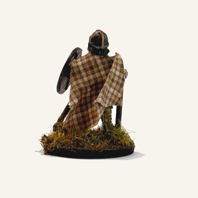
Weave of War is a small, niche brand creating fabric cloaks for miniature wargaming and tabletop enthusiasts, a community deeply invested in detail, storytelling, and immersion. In a space where authenticity matters, the brand needed to feel as considered as the world’s audience builds.
The opportunity was to craft a distinct identity that could instantly communicate medieval heritage and craftsmanship, while still standing out in a crowded, often DIY-looking market. The challenge lay in balancing richness with clarity, creating something atmospheric and tactile without becoming overly complex or hard to scale across packaging.
At the core of the brief was a knight-led visual identity, designed to anchor the brand in a timeless, battle-worn narrative. The result needed to feel immersive and collectable, capturing the spirit of the battlefield while maintaining a clean, recognisable presence fit for a growing product range.
Forging an
Identity
PROJECT: Visual Identity Design
DELIVERABLES: Logo/ Brand Identity/Packaging
TIMELINE: 6-8 Weeks
Weave of War needed a brand that matched the depth and immersion of the miniature wargaming world. It wasn’t enough to look medieval; it had to feel authentic to an audience that values detail, lore, and craftsmanship, while standing out in a cluttered, often DIY space.
The challenge was creating a rich, heritage-driven identity that could still work at a small scale across packaging and labels. With a clear brief for a knight-led direction, the tension lay in balancing detail with usability, building something immersive, yet clean, flexible, and easy to recognise.
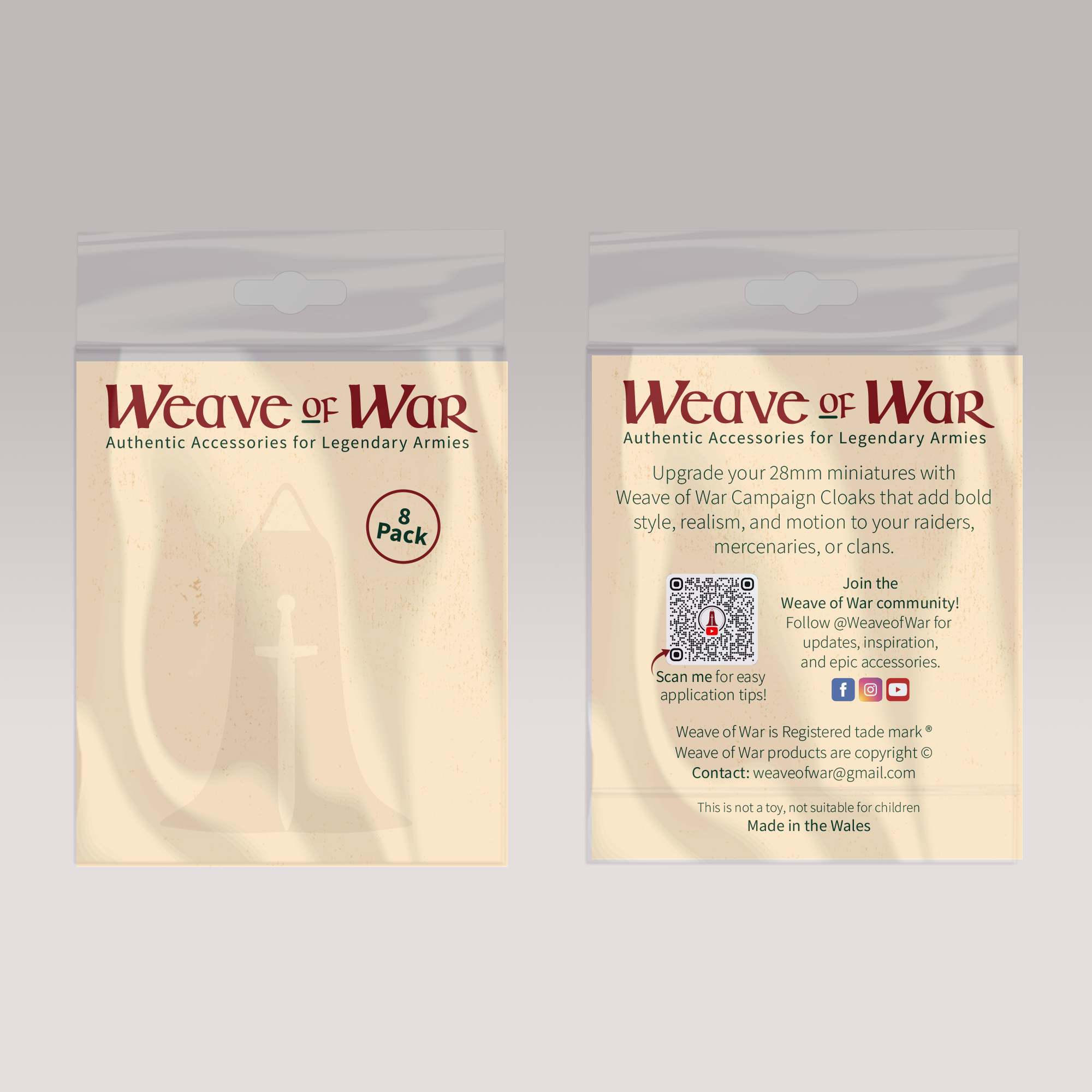
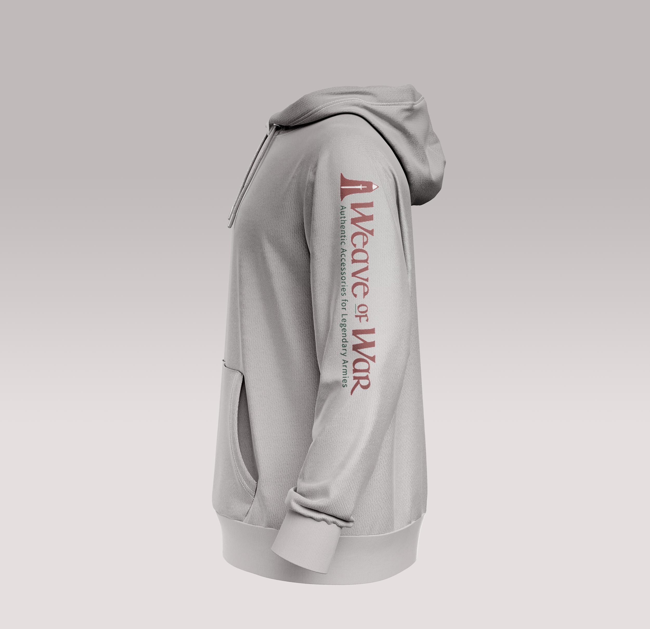
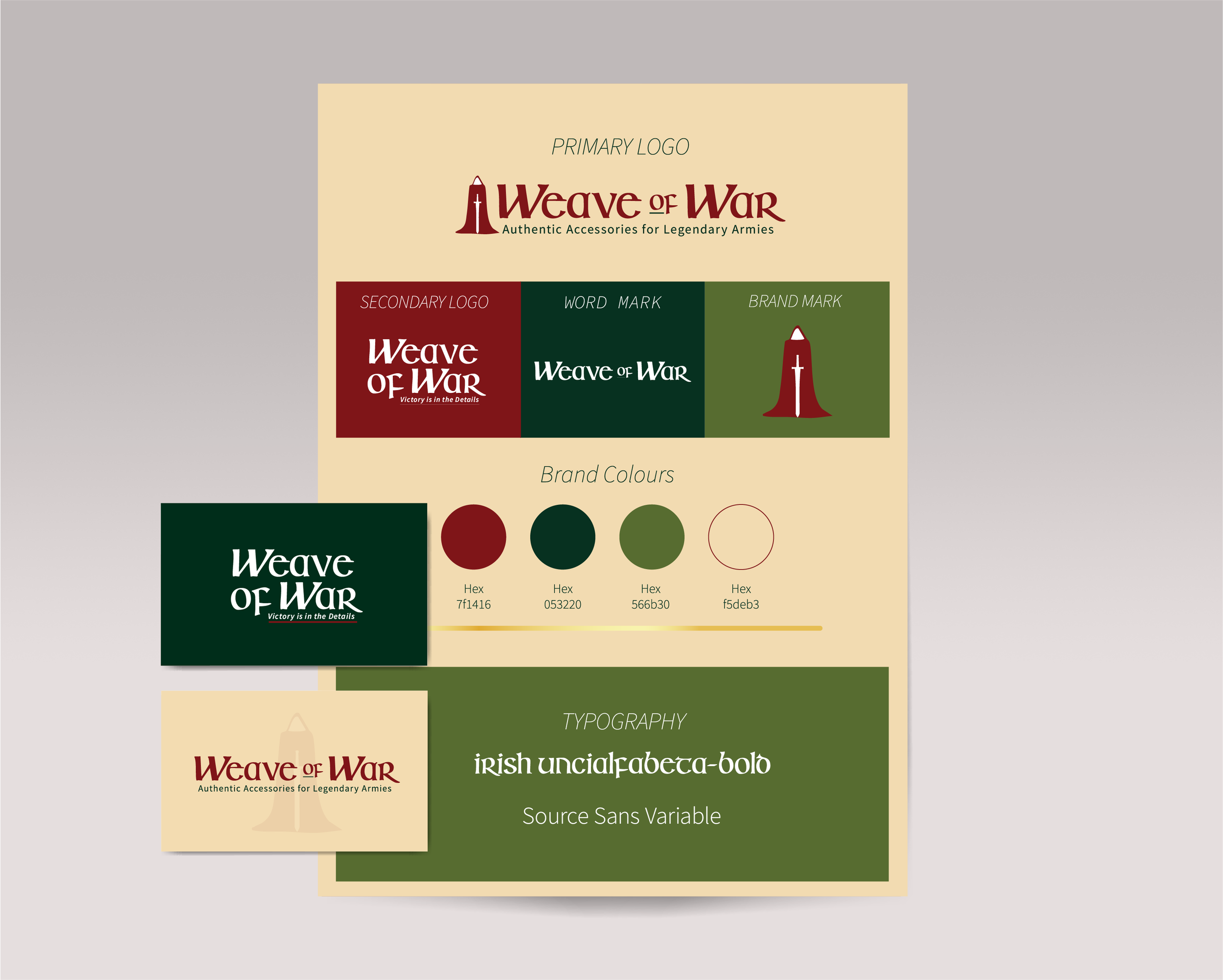
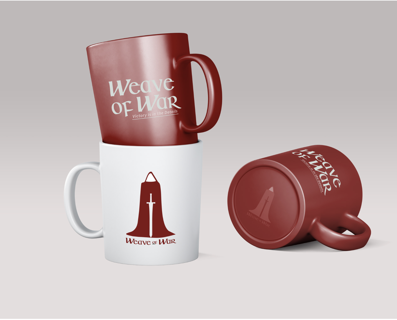
The idea was to create a brand that feels like it belongs within the world of miniature wargaming, more artefact than identity. Drawing from medieval heraldry and craftsmanship, the design focused on authenticity over decoration.
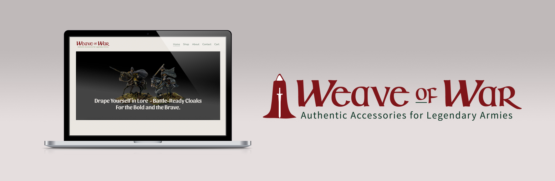
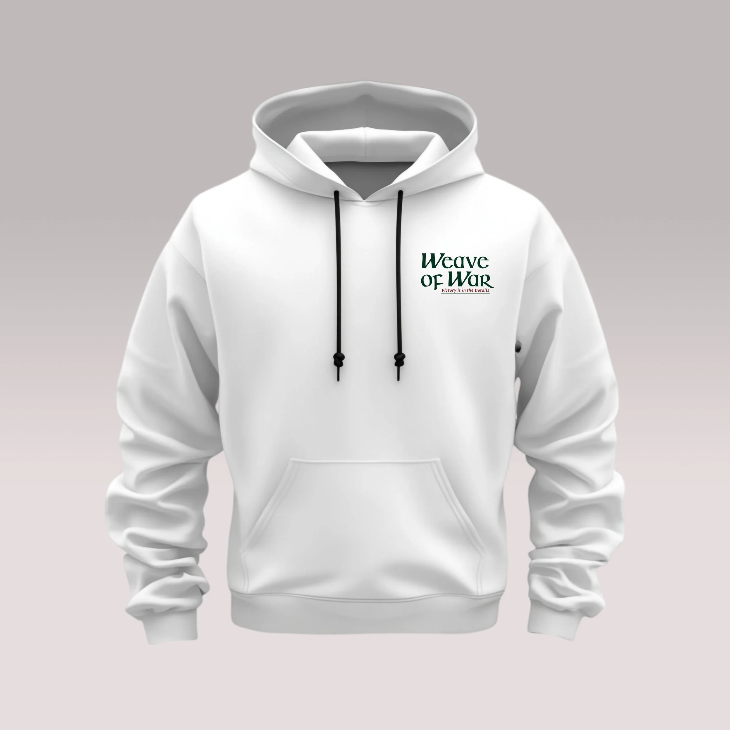
The knight mark anchors the system, combining cloak and sword to link the product with the narrative. Typography balances heritage with clarity, while a muted, tactile colour palette reinforces a sense of age and realism.
Every choice was about controlled detail, building something immersive and characterful, yet clean, scalable, and easy to recognise at small sizes.