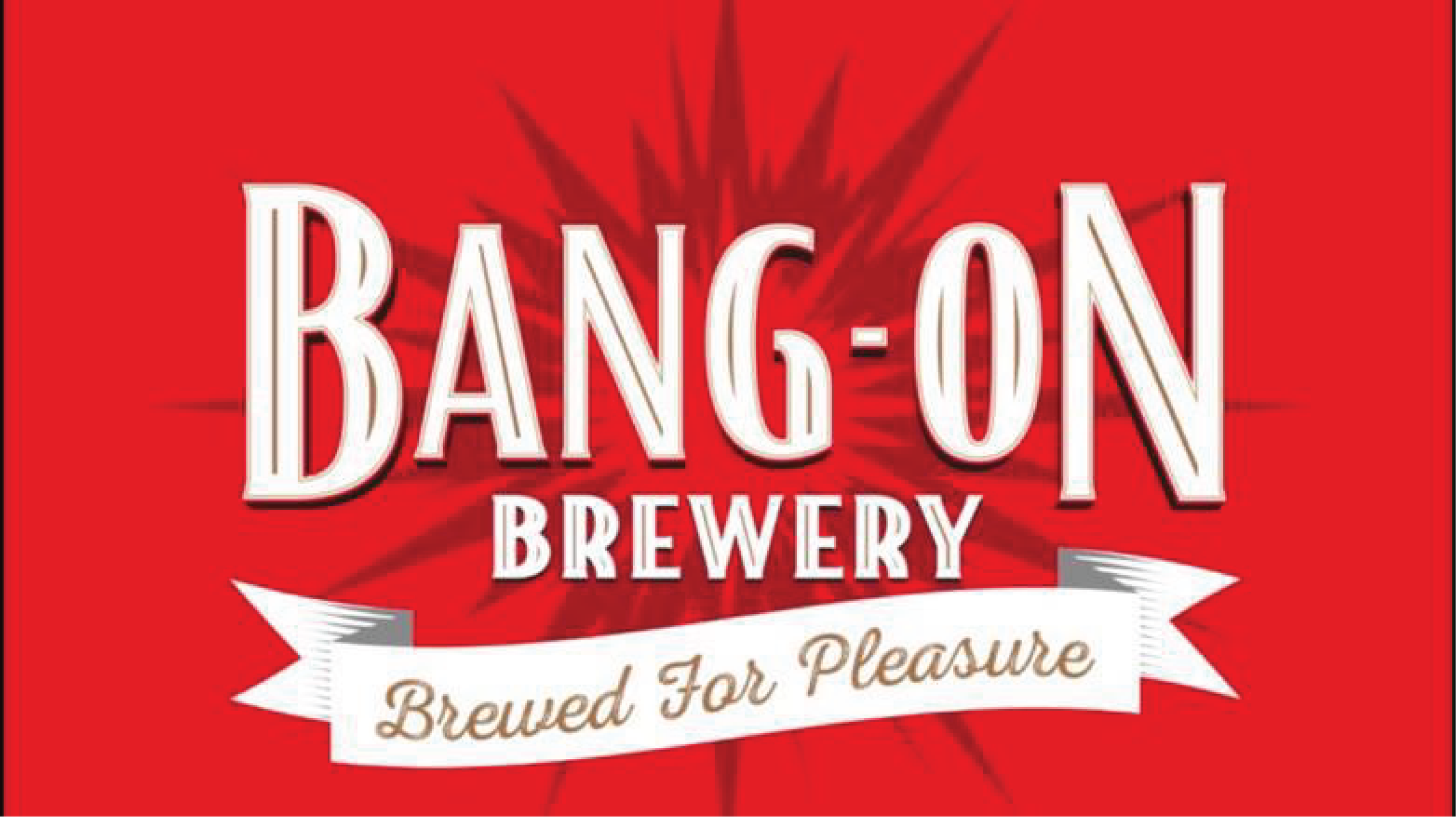
BANG-ON
BREWERY
Bang-On Brewery is a bold craft beer brand known for its expressive, high-impact identity. This project explored how the brand could enter a Michelin-starred restaurant setting without losing its character.
The challenge was to refine a loud, playful packaging system into something more minimal and elevated, suited to a premium dining environment.
The result is a monochrome label concept that strips back the original red palette and starburst motif, creating a cleaner, more refined system that positions Bang-On as an artisanal craft brewery suited to high-end hospitality while remaining instantly recognisable.
PROJECT: Brand Refinement
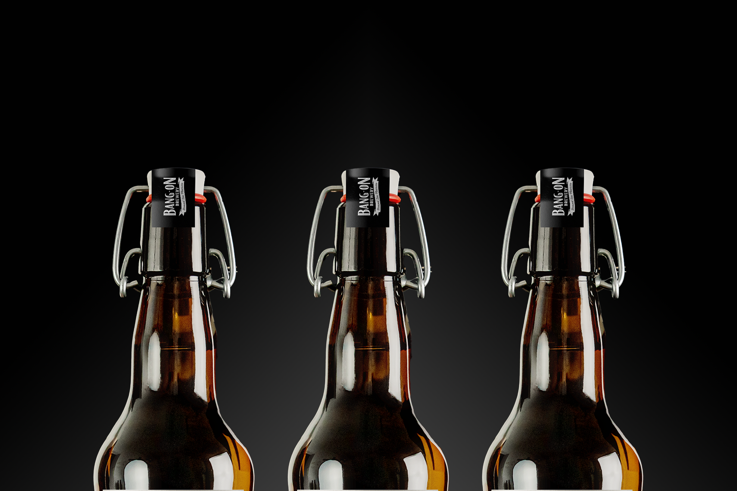
DELIVERABLES: Label Design / Brand identity
TIMELINE: 3 - 4 Weeks

Old World
Refinement
Bang-On Brewery needed to move from loud, expressive packaging into a Michelin-star restaurant setting without losing its identity. The existing design felt too bold and informal for a premium environment, creating a clear mismatch in context.
The challenge was to refine, not reinvent, a strong visual brand, finding the balance between restraint and personality.
With little room to change direction, the work focused on adapting an established identity into something more elevated and structured, while still keeping its recognisable edge.

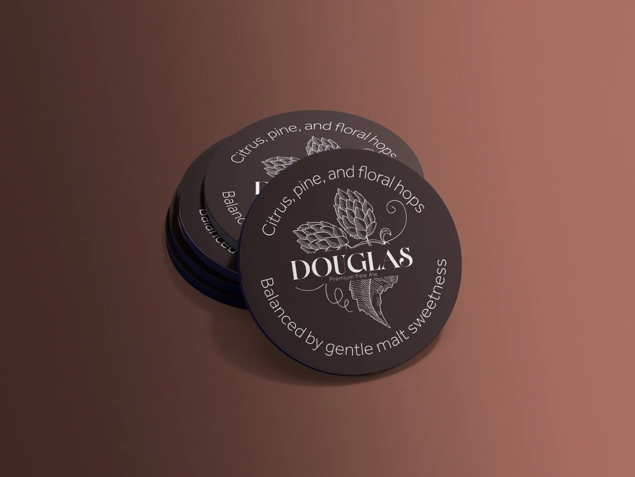

The concept for Bang-On Brewery’s label system was driven by the idea of old-world heritage meeting modern restraint. “Douglas” was positioned as the hero product name, evoking a sense of tradition and grounding the beer in a more established, premium narrative suitable for fine dining.
To reinforce this, a modern serif typeface was used for the name, introducing a sense of heritage, craft, and quiet authority. This was intentionally contrasted with Effra, a clean sans serif used for supporting information like “Premium Pale Ale,” creating a clear hierarchy and balancing tradition with contemporary clarity.
The shift away from bold graphics and into typographic confidence was a strategic decision to elevate perception without losing character. Instead of relying on visual noise, the design leans on composition, spacing, and typographic contrast to communicate quality and restraint.